knowledge library / Custom Rug Colors: Building a Palette That Works in the Room
Custom rug colors let you adapt a design to the materials already in a room. At WOVEN, the process begins with a chosen rug or design, physical color references and a clear plan for where each color belongs. Yarn selections, artwork and a woven strike-off then translate that palette into a rug; a screen image alone cannot settle the final color.
The most useful starting point is often already on the project table: upholstery, a timber finish, a stone sample or a painted cabinet door. Bring those relationships into the rug brief before choosing individual shades.
Give the rug a role in the palette
A custom palette works best when the rug has a clear job. It might connect the sofa to the floor, introduce a darker note beneath pale furniture, or carry a small color from an artwork across a larger surface. Decide which of those matters most before trying to match every finish.
For an illustrative room with cream upholstery, dark wood and a clay-colored chair, we would compare a quiet ground with a restrained clay accent against a warmer ground with less contrast. Both use the same room references. They create different relationships between the furniture and floor.
The question is specific: should the rug bring the clay color forward, or let the chair remain the only strong note? A clear answer makes color selection more purposeful than collecting many near-identical neutrals.
Choose the design before assigning colors
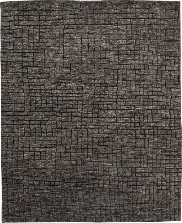
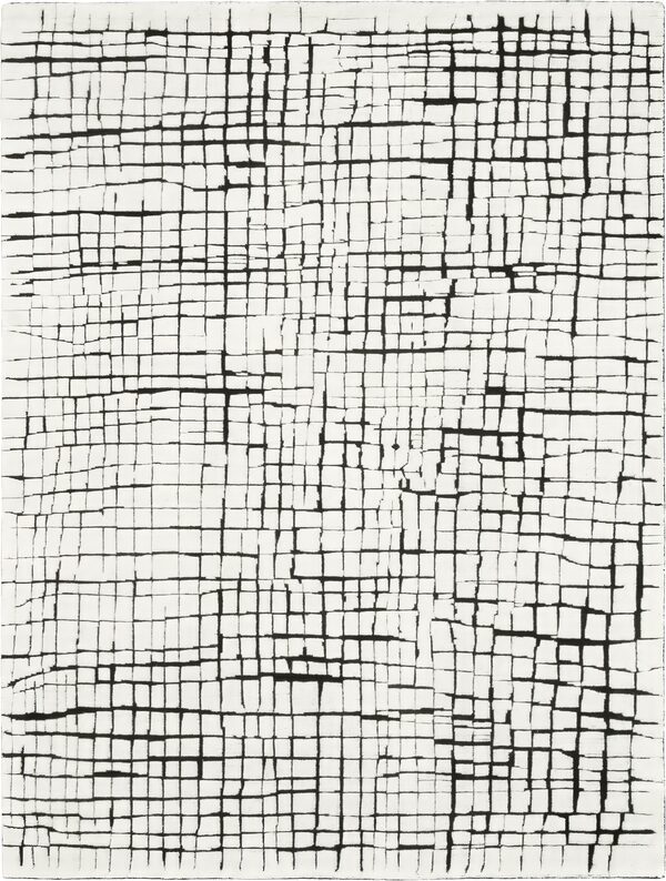
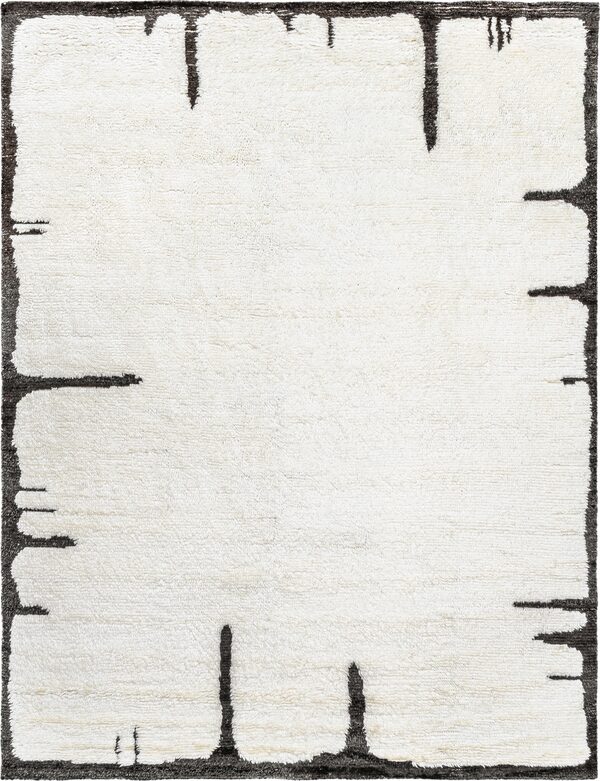
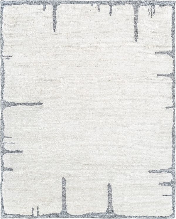
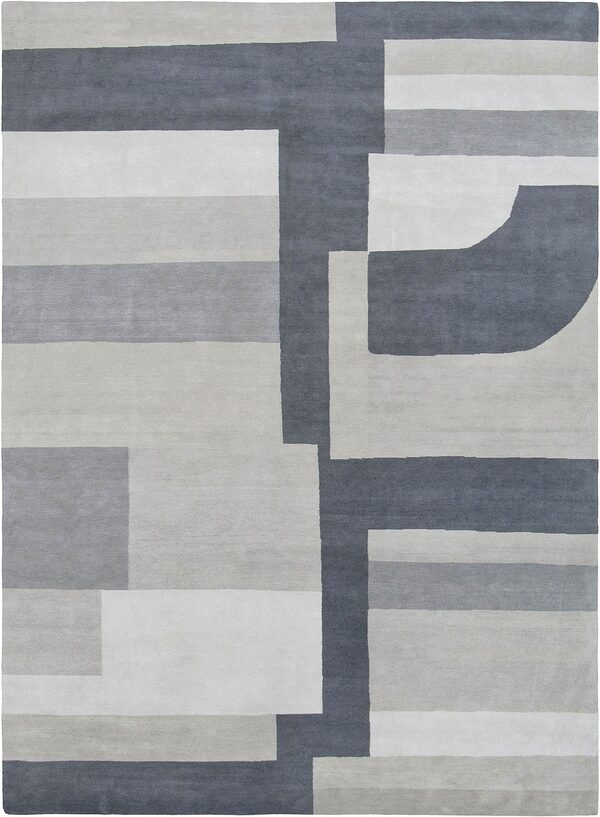
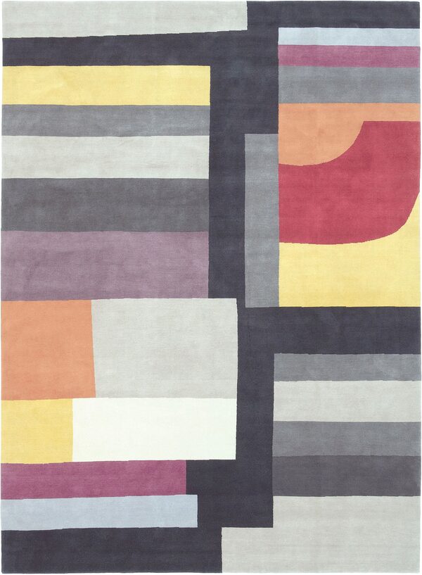
Color placement changes how a pattern reads. A shade used across the main field occupies more of the room than the same shade in a narrow border. Before selecting yarn colors, mark the areas you want to change on an image of the chosen design.
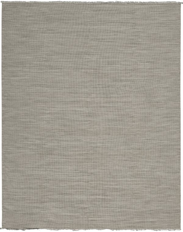
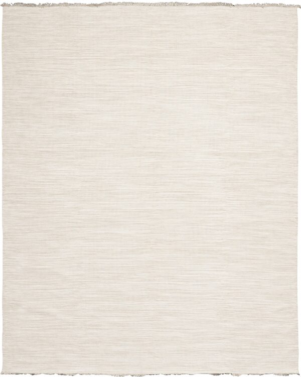
Our bespoke process uses that marked design alongside color references to develop artwork. For patterned rugs, distinguish the field, border and individual motifs. For a largely tonal rug, explain whether you want the surface to read as one color from a distance or show a more visible variation.
| Part of the design | Decision to make | Useful direction |
|---|---|---|
| Main field | How light or dark should the largest area appear? | Keep the field lighter than the sofa. |
| Border | Should the edge blend in or frame the rug? | Keep the border close to the field color. |
| Motif or accent | Which room element should it connect to? | Relate the small motif to the clay upholstery. |
These are examples of design instructions, not formulas. The exact pattern may have different areas to identify. The important part is making the intended relationship visible.
Compare physical color references together
Yarn poms are small bundles used to compare yarn colors. Review them with the project's actual materials, in lighting as close as possible to the room where the rug will sit. Keep the same upholstery, wood and paint references beside every option so that the comparison remains consistent.
Surface matters as well as hue. Fibers with more sheen can reflect nearby colors, so a yarn selection should relate to the rug's material and construction. A color bank suited to one quality is not automatically the right reference for another. WOVEN's bespoke process identifies the appropriate yarn references for the chosen rug.
Photographs help record a selection, but they cannot replace the physical reference. A phone screen is useful for discussing which area of the design should change; it is less useful for settling a close choice between warm gray and brown.
Turn the palette into a short color brief
A good custom-color brief records the chosen design, the physical references and the placement of each proposed color. Include the rug size, room, target date and budget so the palette can be considered as part of the complete order.
For example: “Use the selected design at the proposed room size. Keep the field close to the pale upholstery, use the darker yarn reference in the border, and retain only a small clay accent. Compare the woven sample with the attached fabric and wood references.”
That brief explains both the color choices and their purpose. Keep one current marked image with it; conflicting versions make a simple change harder to follow. Our custom rug specification checklist covers the other details needed for a complete brief.
Review the palette in woven form
A custom-color strike-off is a woven sample made to assess the proposed result before the full rug proceeds. Artwork shows the arrangement of colors and pattern; the strike-off shows how that direction translates into the chosen surface. WOVEN's custom process calls for a strike-off when colors change.
Review the sample against the same room materials used at the beginning. If a change is needed, name the affected area and the desired adjustment rather than asking for the whole rug to be “warmer.” The samples and strike-offs guide explains the approval stage in more detail.
Start with the designs in STUDIO WOVEN, then bring together the few physical references that define your room. A considered palette begins with those relationships and becomes specific enough to weave.