knowledge library / What Are Quiet-Luxury Rugs? Choosing Depth Without a Loud Pattern
Quiet-luxury rugs bring interest through considered color, texture and proportion without demanding all the attention in a room. At WOVEN, we use the term as a design direction, not a material specification or quality grade. A tonal woven surface or a softly contrasting patterned rug can both serve that purpose when their scale and character suit the space.
The useful question is how the rug behaves within the composition. Does it give the furniture a clear setting? Is there enough detail to reward a closer look? A rug can be restrained without being featureless, and richly patterned without becoming the room's loudest element.
Quiet depends on contrast, not simply on beige
A quiet rug has a considered relationship to the other surfaces around it. Color contrast, the strength of its border and the size of its motifs all affect that relationship. A cream rug on a dark floor may create a stronger outline than a deeper rug close to the floor's tone.
We would begin by deciding what should lead the room. If the artwork or a sculptural chair is the focus, let the rug support it. If the room feels visually empty, a restrained repeat or more visible texture can supply interest without adding another dominant object.
Brown, gray, muted blue and green can all belong in this approach. Choose the relationship first, then the color name. A neutral label alone says little about how a rug will look beside the actual upholstery and flooring.
A tonal surface can carry its own detail
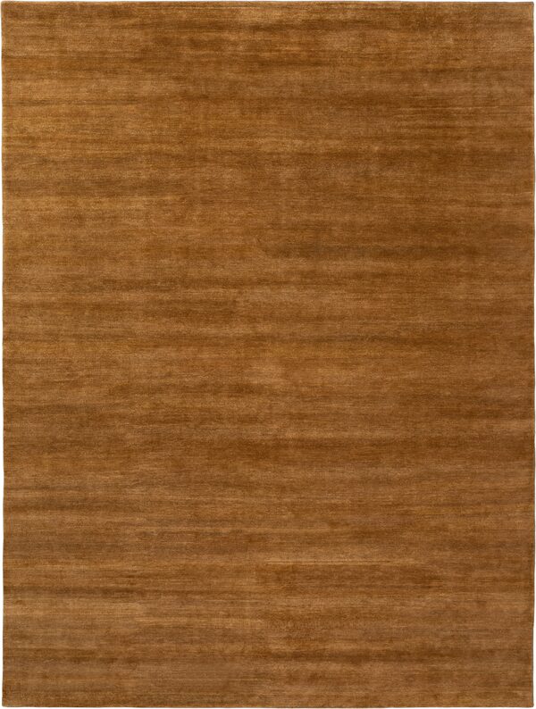
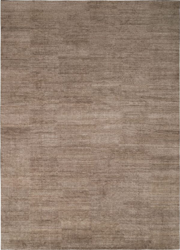
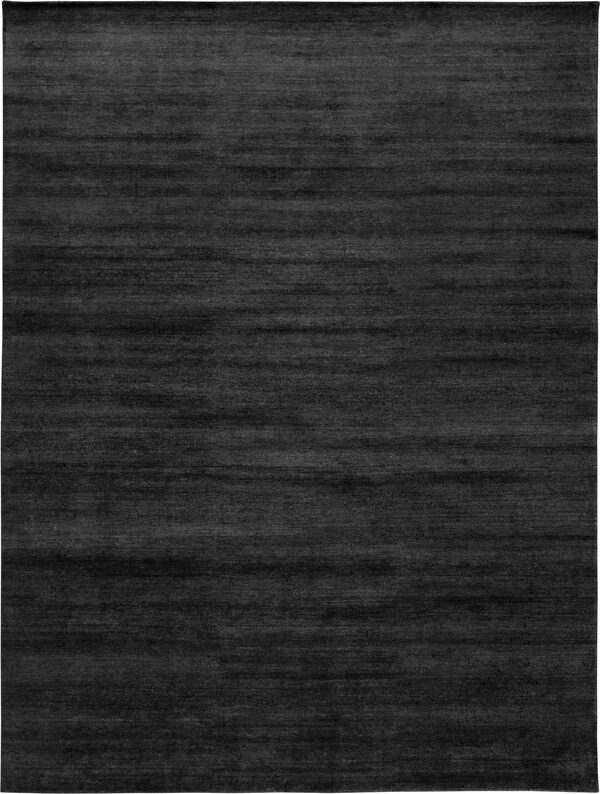
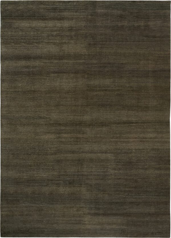
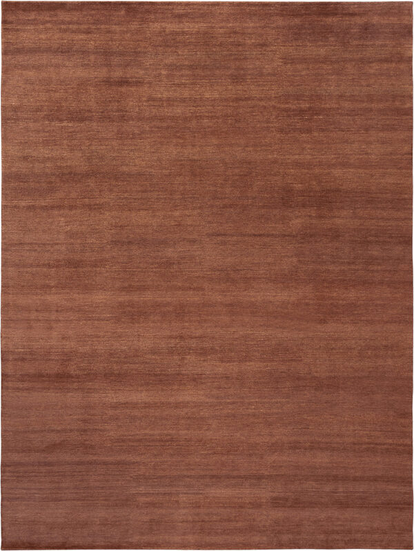
WOVEN's Wool Strata offers one documented example of interest within a close palette. Our texture guidance describes undyed wool yarns, natural heathering and a low sheared pile. The color movement is part of the quality's character rather than a printed motif laid over an otherwise uniform surface.
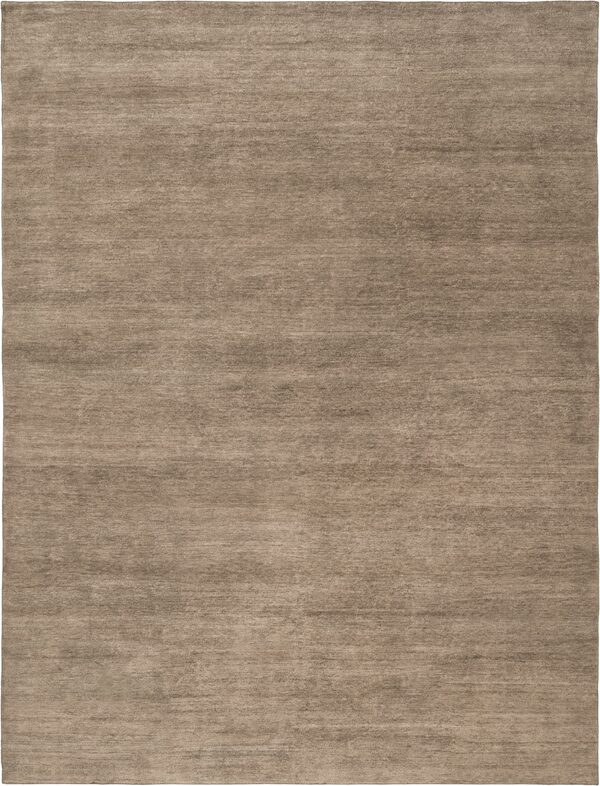
Fine Flatweave provides a different starting point: a low-profile woven surface. Its undyed colorways are listed as 60% wool and 40% linen, while its dyed colorways are 100% wool. That distinction matters when comparing samples. A similar tone does not make two colorways the same material specification.
Explore the STUDIO WOVEN Textures collection with those differences in mind. We would compare a heathered, sheared surface with a low-profile weave to decide how much visible movement the room needs. This is a visual comparison, not a claim that one will perform better in every setting.
A patterned rug can still be restrained
Quiet luxury does not require removing pattern. A floral or geometric design can sit gently in a room when its colors are close and its contrast belongs with the furniture. The amount of ornament and the strength of that ornament are different choices.
For example, WOVEN's Tabriz 13648 has a medallion composition with fine ornament around a pale field. Its photograph illustrates an alternative to a plain rug: the pattern is present, but open intervals and close tones give it room. Whether it feels quiet in your scheme depends on the floor, furniture and how much of the border remains exposed.
When comparing a patterned antique with a new texture, keep the questions fair. The antique has an existing size and an individual condition record. The new quality has its own material and care information. A similar visual mood does not make their practical details interchangeable.
Compare three kinds of restraint
A useful shortlist separates the effect you want from the product that might deliver it. Try these three directions on the same furniture plan before narrowing the palette.
| Design direction | What creates the interest | What to compare |
|---|---|---|
| Tonal texture | Yarn, surface and small shifts in color | Whether the texture has enough presence from the doorway |
| Close-toned pattern | Motifs with limited color contrast | Whether the border or repeat becomes stronger beside the floor |
| Deeper supporting field | A rug that relates closely to darker room finishes | Whether furniture still has a clear outline against it |
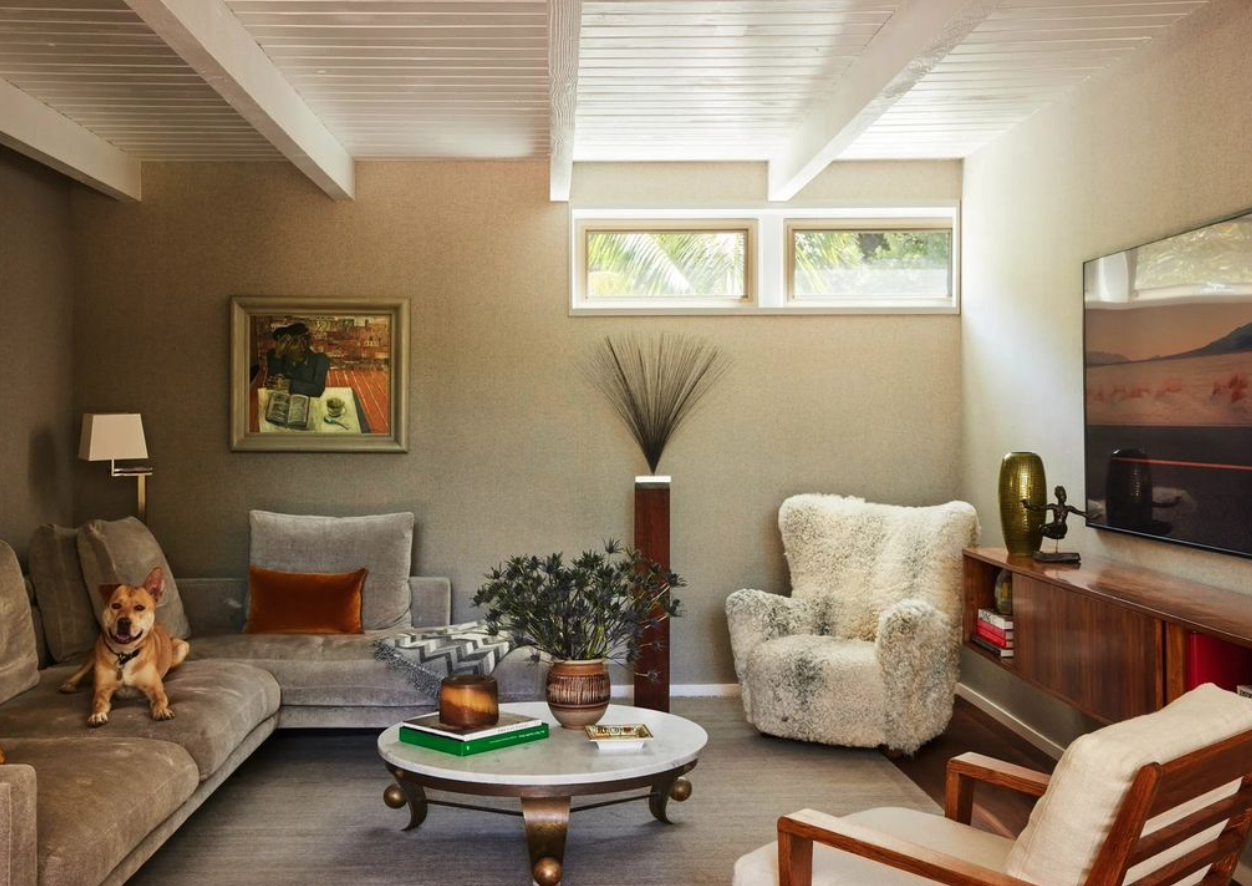
Consider an illustrative room with a walnut table, a warm gray sofa and a large painting. A pale rug might emphasize the seating area's boundary. A deeper tonal rug might connect more closely to the table and let the painting lead. A patterned option could add detail where the upholstery is plain. We would test those relationships rather than assume the palest option is the most understated.
Keep the quiet look compatible with daily use
A restrained appearance does not promise easy care. Texture and material still need to suit the room. Our Wool Loop guidance, for example, cautions against high-suction vacuuming on its looped surface. That advice belongs to the quality, regardless of how quiet its color may look.
Our rug material guide helps organize the practical comparison. If natural shade variation is part of the appeal, the undyed wool guide explains what that description establishes and what it does not.
Choose the rug's role, compare the surface and pattern at room scale, then check the exact material and care guidance. The result should feel settled alongside the things you already value in the room. Quietness comes from that relationship, not from a prescribed color or an expensive-sounding fiber name.